HOMBRE Exclusive: Artist Ryan McGinness Brings Light to New HENNESSY V.S Limited Edition
27 Aug 2015 by Francisco Romeo in Career, Celebrities, Fame, General, Home, Pleasure, Power, Products, Profile, Spirits

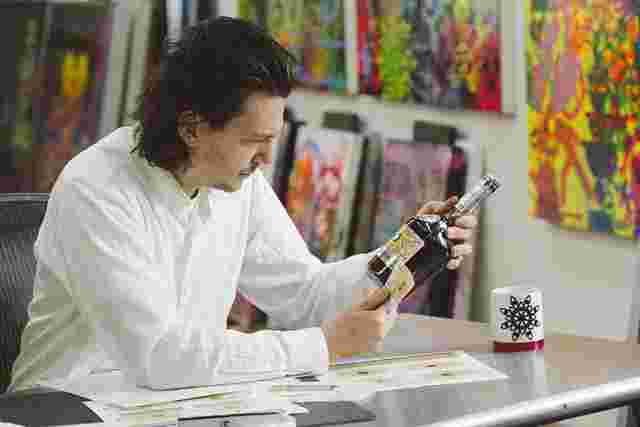
The latest artist honored with the task of designing an iconic label for Hennessy V.S is Ryan McGinness. He follows on the groundbreaking works of KAWZ, Futura, Os Gemeos and Shepard Fairey. At HOMBRE we have been first to cover these new releases, and bring you the behind the scenes stories and exclusive interviews with these influential artists. We continue that tradition with our in-depth, one-on-one conversation with McGinness. Here you’ll find select photographs tracing his journey from Cognac, France to his New York studio, as he creates this colorful and ‘fancy’ design. After launch events in New York, Miami, Philadelphia and Los Angeles; the new Hennessy V.S Limited Edition bottle is now available worldwide.
McGinness is a multi-disciplinary artist whose work includes drawings, paintings, sculptures, prints, books, products, and installations. Throughout his stellar career, the Virginia born innovator has been heralded as “a leading pioneer of the new semiotics” and “an art star.” His works have been exhibited in prestigious galleries and museums around the world, including the Museum of Modern Art in NYC, Museum of Contemporary Art San Diego, the Virginia Museum of Fine Arts, MUSAC in Spain and the Misumi Collection in Japan.
To seal the profound value of his craft and this special collaboration with Hennessy, McGinness has also embraced the opportunity to extend his ongoing Black Holes series— one of the artist’s most renowned bodies of work—through his Hennessy Very Special Limited Edition label artwork.
With this commitment to intention and consistency as virtues, Ryan McGinness embarks on a collaborative journey with Hennessy that—like his work—is destined to captivate the imagination of audiences worldwide.
HOMBRE: What was your reaction when asked to be part of this collaboration with Hennessy?
Ryan McGinness: The first thing I did was contact the other artists who’ve done it and talk to them about the project, the pros and the cons and have them inform me whether it was something I should do. Then I went through the process of whether it was a good match for me personally. And thirdly, just a pragmatic sense of whether it was good timing.
H: You spoke to all of them?
RMG: I believe the first one was KAWS, then Futura, Os Gemeos, and then Shepard (Fairey); so that would make me fifth.
H: What did they tell you?
RMG: They said to do it. Each artist took something away from the project and molded it. I looked at what they did and wanted to do something different. For instance they had dark labels, I wanted to do something lighter. That informed the concept for my initial approach.
 H: How was your visit to Cognac for inspiration?
RMG: It was magical. It was incredible to see their process, having shared my process with them. I immediately recognized the parallels conceptually between what they do and what I do. It was great to go into where only a few people have gone, to meet the tasters, go into the cellars… I went there with my family and got the royal treatment, meaning that they even had a princess dress for my 3 year-old daughter upon our arrival.
 H: What impressed you most about that visit?
RMG: The history. I had no idea how far back their cellars went. And how much has survived through all kinds of wars and natural disasters. How protected their cellars are, how rich their archives are. I also had a chance to see their historical print materials.
H: Did that play a role in what you would create?
RMG: Only in the way that I understood more my contribution, and how their gesture of embracing contemporary artists throughout history is really significant. It played a role conceptually, not aesthetically. For me it meant that the pressure was on.
 H: How was the process of working with Hennessy?
RMG: Very straightforward. We started with the sky is the limit. I had to figure out which of my bodies of work would be a good match. It seemed like the “Black Holes” series was the best match. It was the best approach for what I wanted to communicate, and again, it was this idea that’s very light and airy and bright. An uplifting feeling. Not only the color palette, but the artwork itself, the visuals. These black holes which are composed of these flourishes and these fleur-de-lys. For me they’ve always been symbols of luxury and aspirational, so I thought that was a good match.
H: What did you hope to create?
RMG: With the “Black Holes” paintings I wanted to create this body of work that represented fanciness and luxury. I wanted to make the fanciest painting that I ever could. With Hennessy being a luxury brand it just made sense for me to use that body of work. When that was decided creating the actual artwork was very straightforward and there was very little back and forth.
 H: What else is different about this label design?
RMG: We decided on a color palette, and it was a challenge for Hennessy on how to print fluorescent labels. They were up for the challenge and I think they’re the first to use fluorescent, black light reactive inks on a label. That’s a big differentiation from the past labels and one of the things that makes it exciting for me. They used the same inks that I use in my paintings which are fluorescent, black light reactive. The kind of material that forces you to have to look at the paintings in person, or forces you to have to experience the label in person.
 H: How long was the process ?
RMG: As these things go, with full production and a lot of lead time, the artwork was actually completed more than a year ago, to set everything in motion. Then there were tweaks here and there. We worked on it for a whole year. Most of the work was done upfront, we had a lot of ancillary materials that had to be designed. The packaging, the box, the point of purchase, even down to the launch event materials had to be done.
 H: How difficult was it to blend your artistic vision with the heritage of the brand?
RMG: It seemed rather seamless. Very smooth. Conceptually the “Black Holes” series seemed to be a good match with what Hennessy is as a brand. Also it was very easy to take one element in the history of Hennessy and change it and make it my own. That one element is the seal, the arm that holds the ax. I went around and around and decided that we wanted to make it more of a peaceful kind of symbol. So now it’s this hand holding this flower and the petals of the flower are actually radiating eyes. These radiating eyes are drawings that I’ve used in a lot of my paintings so it becomes sort of autobiographical. And that’s a more direct way of merging what I do with what they’ve done in the past.
 H: Tell me about the metadata that you included in the label.
RMG: Not only are we exploiting the printing process in using inks that have never been used before, but we are also including a lot of the information that you normally don’t find on a label, like the government warning, the alcohol content; all that becomes an integral part of the label as opposed to being treated as ancillary information.
 H: What do you hope people feel when they look at the label?
RMG: A positive, kind of uplifting feeling, a spiritual kind of enlightenment of sorts. That was the idea of using the bright colors and the light backgrounds.
H: What are some of the other projects you’re working on?
RMG: I am finishing up this project on Instagram that I’ve been working on for over two years. What I’m doing is posting this little black and white buttons with sayings every day, which are being pulled from twenty years of notebooks. I’m at over a thousand posts right now. Believe it or not each one of those is a little element leading to a larger whole. All these buttons are half tones that are building a large half tone photographic image. That will be coming in the next few months. I’m working on finishing that project. I’m also opening an exhibition of sculptures in the Hamptons. I’m always working on new books and new projects and exhibitions. My next big exhibition will be in Los Angeles in early 2016. … and… it’s hard for me to keep track of everything that’s why I write everything down.
H: What’s your key to success?
RMG: It sounds so cliche, but it’s really just to concentrate on the work. And just work. In every collaboration Hennessy asks the artists for a quote for the back of the label and mine is simply one word: Work. That’s the best advice I can give. We’re in a culture seeking approval, seeking popularity, building a so called ‘brand,’ when really none of that matters and it runs the risk of being empty. At the core is just the work. I’ve always been the person that would rather be at the studio working as opposed to going out. Just concentrate on the work and everything else will fall into place.


